Choosing the Right Color Palette for Your Website in 2025
Colors aren’t just about making your website look good—they’re key to strengthening your identity and communicating your business’s message and values. Choosing the right color palette is a strategic move that should align with how you want visitors to perceive your business.
To get it right, think about your industry and target audience. You want your colors to resonate with them and truly represent what you offer.
Here’s a quick guide to help you select a color palette that aligns with the emotions and messages you want to convey. We’ll also share some examples of how we’ve applied those colors across different industries in the websites we’ve designed.
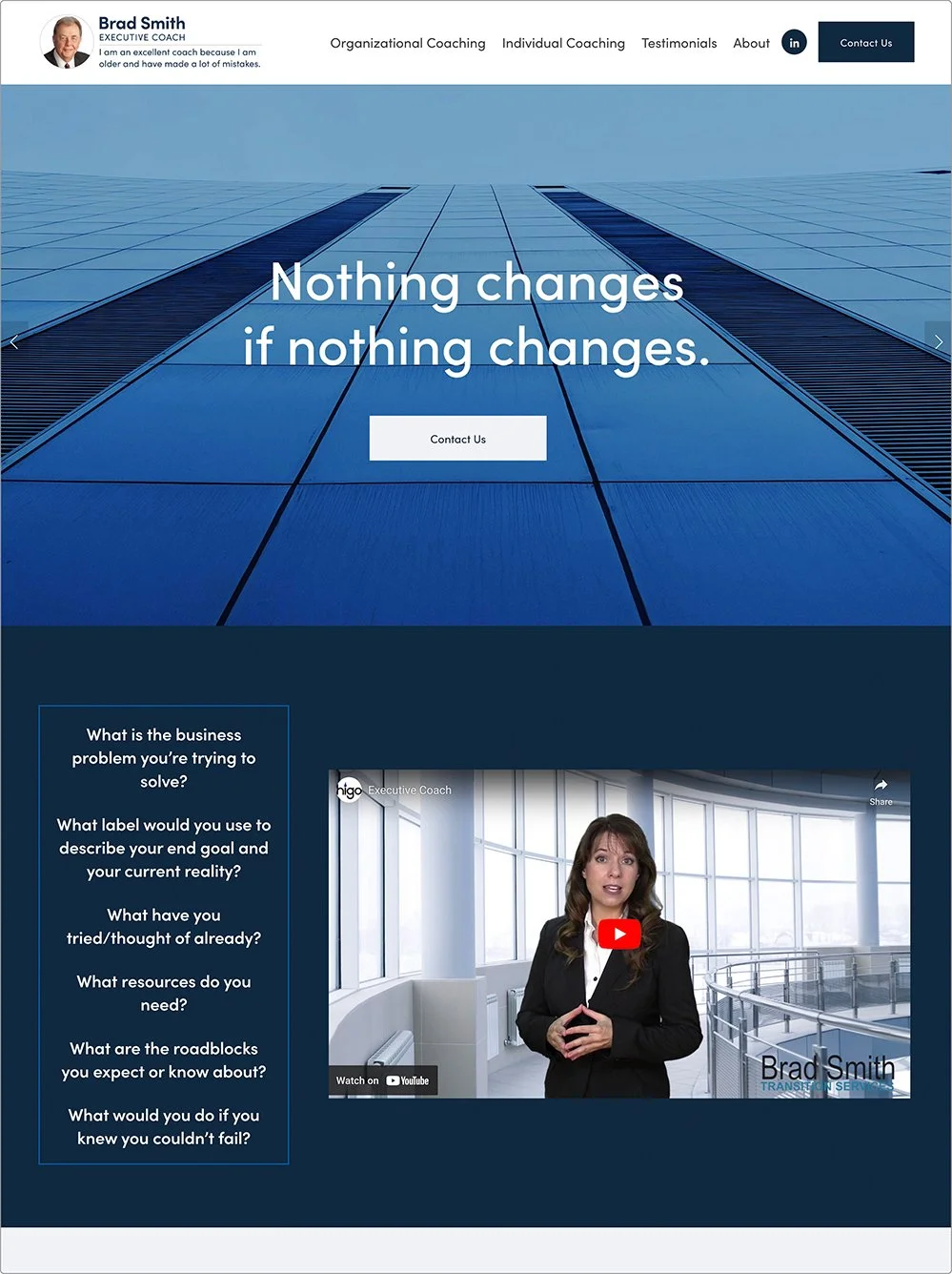
1. Conveying Authority and Credibility
Color Palette: Blues, Grays, and Whites
Description: These colors are often associated with authority and competence. Incorporating white or light gray accents can help balance the palette and maintain a clean, sophisticated look.
Some industries that can benefit form these colors are:
Finance & Banking: Transmits confidence and trust.
Legal Services: Conveys authority and seriousness, reassuring clients of expertise.
Consulting & Professional Services: Demonstrates reliability and a professional approach.
Websites we have designed with these colors:
2. Expressing Creativity and Innovation
Color Palette: Oranges, Teals, and Purples
Description: Bold and vibrant colors like oranges, teals, and purples evoke feelings of creativity, energy, and innovation. These colors can make your website stand out and appeal to a creative audience or just showcase your bright personality.
Some industries that can benefit form these colors are:
Creative Agencies: Reflects originality and a dynamic approach.
Tech Startups: Suggests forward-thinking and cutting-edge solutions.
Design & Art: Highlights artistic flair and uniqueness.
Websites we have designed with these colors:
Membership Organization for Content Professionals
Consultant Services for the Neuro Diverse Community
3. Inviting Warmth and Friendliness
Color Palette: Soft Blues, Greens, and Pastels
Description: Soft blues and greens, along with pastel shades, create a calming and approachable atmosphere. These colors are often used to convey warmth, friendliness, and a welcoming vibe.
Some industries that can benefit form these colors are:
Healthcare & Wellness: Reassures patients and clients, creating a soothing environment.
Education & Training: Makes learning environments feel inviting and supportive.
Customer Service & Support: Ensures a friendly and approachable brand image.
Websites we have designed with these colors:
4. Instilling Energy and Excitement
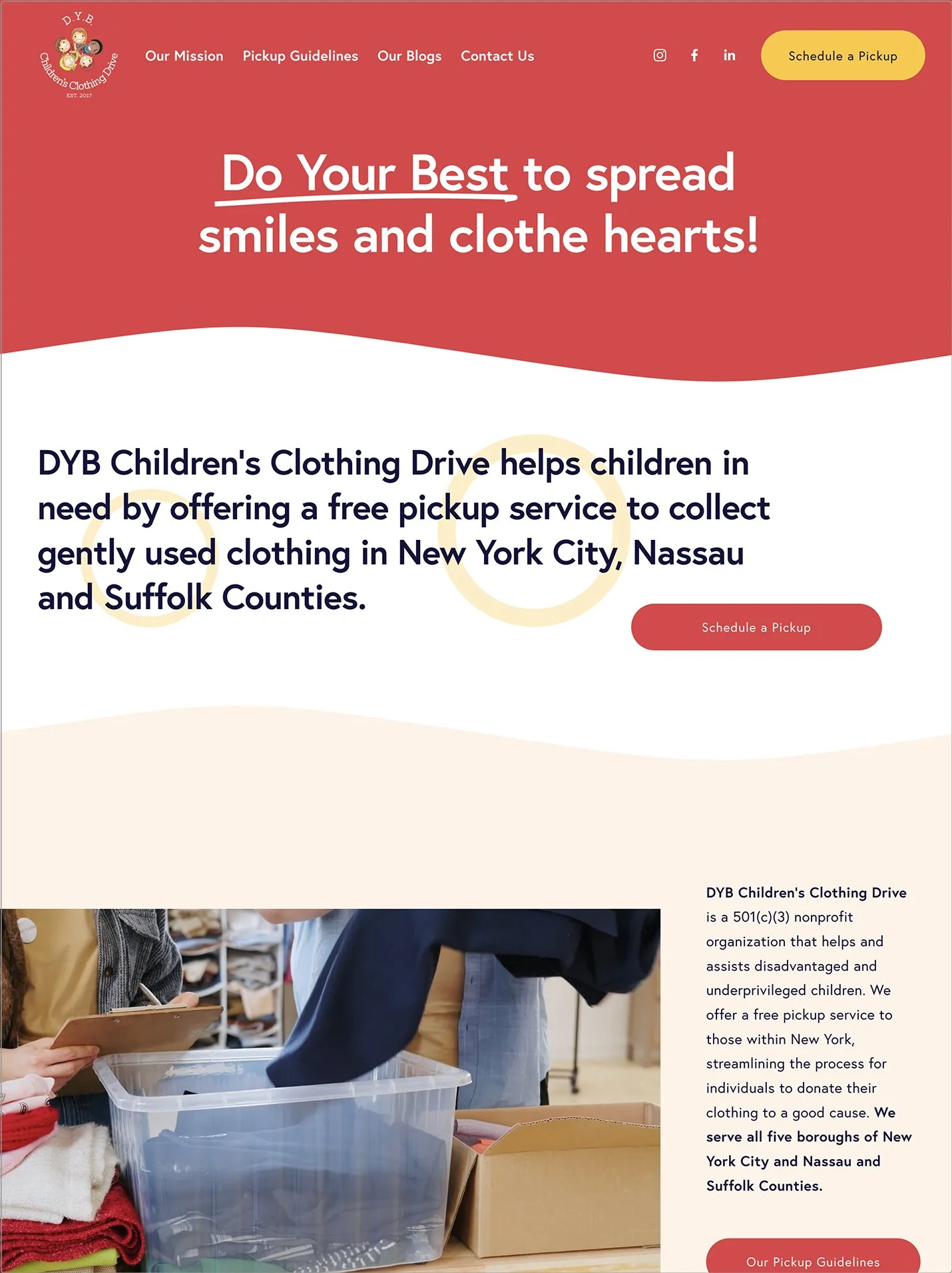
Color Palette: Bright Reds, Yellows, and Bold Greens
Description: Bright and energetic colors like reds, yellows, and bold greens can create a sense of urgency, excitement, and enthusiasm. These colors are ideal for driving action and engagement.
Some industries that can benefit form these colors are:
Retail, E-Commerce, and Nonprofits: Encourages impulse buys or donations and dynamic interactions.
Events & Entertainment: Captures excitement and vibrant energy.
Fitness & Sports: Inspires action and motivation.
Websites we have designed with these colors:
Revolutionary Wellness Retreats
Coaching and Retreats
D.Y.B. Children’s Clothing Drive
Nonprofit Clothing Donation Organization
5. Emphasizing Elegance and Luxury
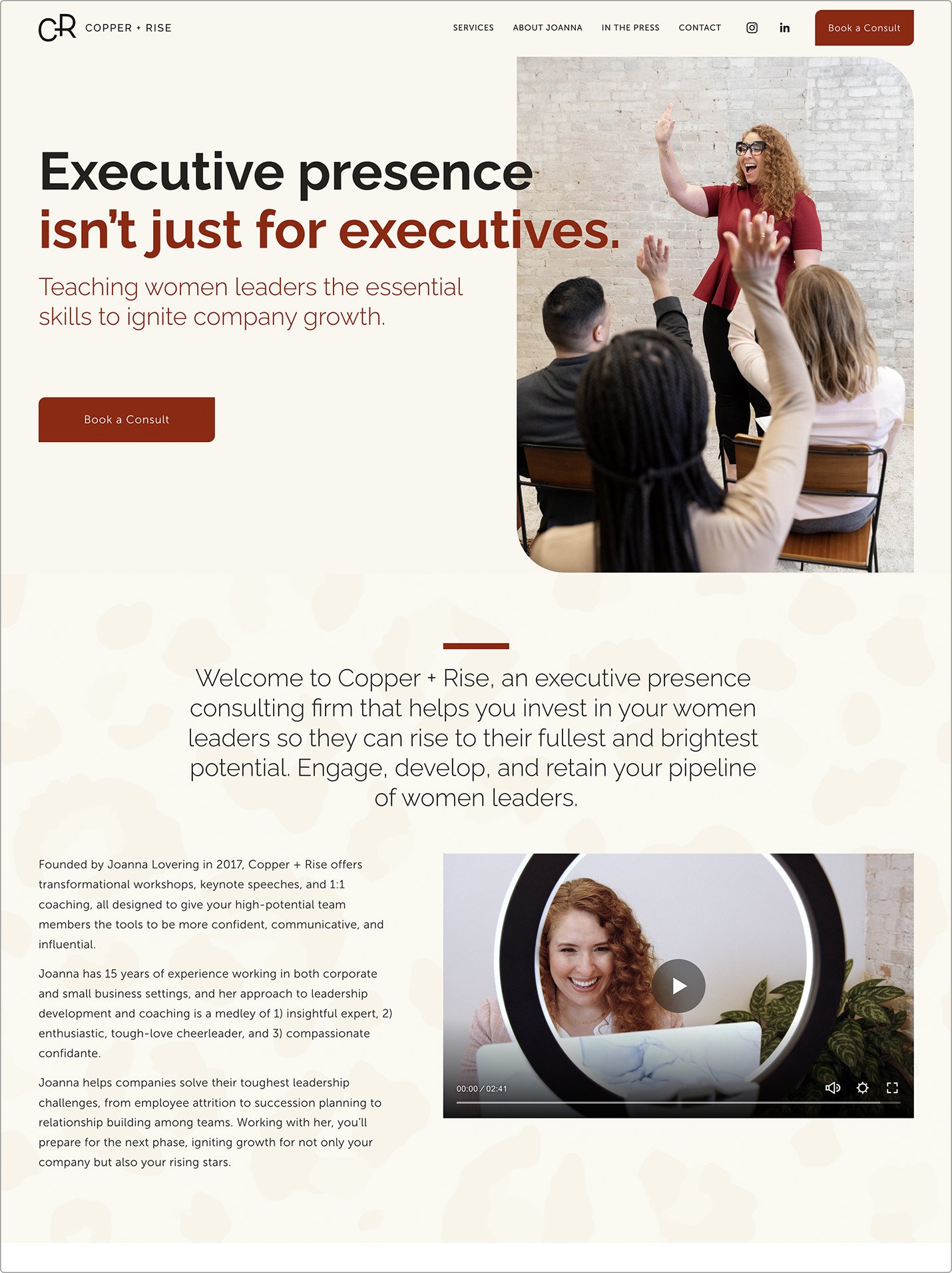
Color Palette: Deep Blacks, Golds, and Rich Reds
Description: Deep blacks, rich reds, and golds convey a sense of luxury, sophistication, and exclusivity. These colors are perfect for brands that want to highlight their high-end status.
Some industries that can benefit form these colors are:
Luxury Goods: Showcases premium quality and exclusivity.
High-End Real Estate: Emphasizes opulence and sophistication.
Upscale Services: Projects a premium image and attracts high-value clients.
Websites we have designed with these colors:
These color suggestions are just a starting point. Don’t hesitate to experiment with different combinations to see what works best for your business.
If you’re still not sure where to begin or want to ensure your colors hit the mark, working with a professional can help you create a palette that perfectly captures your business’ vibe.
We’re always here to chat about what your business needs to thrive online.
Schedule a consultation to get started.


